![[Your]HealthResearch](http://images.squarespace-cdn.com/content/v1/5b158e474611a0586019853f/1528398560115-KJX8SG7QK96COPK50VPD/yourHealthResearch+logo.png?format=1500w)
Your Health Research Style Guide
This style guide defines the visual requirements for the Your Health Research brand. It includes guidance for logos, colors, photography, illustrations, typography, and digital presentation.
Use these standards when creating or updating application screens, emails, marketing pages, and other digital materials so the Your Health Research experience remains consistent, accessible, and recognizable.
Logo Requirements
Master Logo

The Master Logo is the primary logo used in the application. It is the logo users should see when they first land on the application and is the main starting point for the user’s relationship with the brand.
Ideal image size: 340px × 50px
Master Logo Examples


Square Logo

The Square Logo is used on mobile devices and in areas where web space is limited. This logo variant is usually presented to users after they have already established a relationship with the brand and can recognize it.
Ideal image size: 75px × 75px
Aspect ratio: 1:1
Square Logo Examples



Do
- Use the Master Logo in primary web headers and landing page experiences.
- Use the Square Logo in compact spaces, mobile layouts, and emails.
- Keep the logo in approved brand colors.
- Preserve the original logo proportions.
- Use high-resolution logo assets whenever possible.
- Provide clear spacing around the logo so it remains readable.
Don’t
- Do not stretch, squash, or distort the logo.
- Do not recreate the logo manually.
- Do not change the logo colors.
- Do not place the logo on backgrounds that reduce legibility.
- Do not use the Square Logo where the Master Logo is more appropriate.
- Do not use low-resolution or blurry logo files.
Favicon Requirements
The favicon is the small icon displayed in browser tabs, bookmarks, browser history, and saved shortcuts. It should be a simple, recognizable brand icon that works clearly at very small sizes.
Provide one high-resolution square PNG source image. We will automatically convert it into the different favicon sizes needed by browsers and devices.
Preferred source image size: 512px × 512px
Aspect ratio: 1:1
Required format: PNG

Do
- Use a simple and recognizable brand icon.
- Provide a square PNG file.
- Use a high-resolution source image whenever possible.
- Make sure the icon remains recognizable at small sizes.
Don’t
- Do not use the full horizontal logo as a favicon.
- Do not include small text or fine details that become unreadable.
- Do not stretch, crop, or distort the icon.
- Do not provide a low-resolution or blurry file.
Institution Logo on Footer
The institution footer logo appears in the application footer and is displayed on top of the footer background color, usually the institution’s primary brand color.
Provide a transparent logo file so the footer background color shows through cleanly. The logo should be prepared in a light or white version when it appears on a dark footer background.
Preferred format: transparent PNG or SVG
Recommended width: 300px to 400px
Recommended height: 40px to 90px
Background: transparent
Logo color: white/light version for dark footer backgrounds
Footer Logo Preview

The transparent logo will be rendered as follows on the footer
Do
- Use a transparent PNG or SVG file.
- Use a white or light version of the logo for dark footer backgrounds.
- Keep the logo readable at footer size.
- Preserve the original logo proportions.
- Use official institution-approved artwork.
Don’t
- Do not use a logo with a white box or solid background behind it.
- Do not use a dark logo on a dark footer background.
- Do not stretch, crop, or distort the logo.
- Do not use blurry, low-resolution, or screenshot-based logos.
- Do not include unnecessary padding around the logo artwork.
Color Requirements
[your]HealthResearch gives you the ability to customize it's colors to meet your institution's needs. Below are the colors that can be specified while standing up the application for your institution or research network.
Brand Colors
These colors set the overarching brand for the platform. They are used on global application elements such as headers, footers, and emails. They should conform to an institution’s or research network’s overarching color scheme.
#BBBBBB
187, 187, 187
#BBBBBB
187, 187, 187
Do
Use deep, dark, bold hues as Brand Colors.
For best results, make sure that the Primary and Secondary Brand colors contrast with each other.
Don’t
Avoid lighter hues. This will cause the white font on them to not show.
Application Colors
These colors are used for the interaction elements within the application, and their varied states. Examples include buttons, tab bars, accordions, and modal headers.
#BBBBBB
187, 187, 187
#BBBBBB
187, 187, 187
#BBBBBB
187, 187, 187
#BBBBBB
187, 187, 187
Do
Use an accessibility contrast checker to ensure your application colors have a high contrast ratio with white text.
Don’t
Avoid lighter hues. This will cause the white font on them to not show.
Background Colors
Background colors are used for setting the background color of the page, and for adding emphasis to text and sections.
#BBBBBB
187, 187, 187
#BBBBBB
187, 187, 187
Do
Use lighter hues for background colors.
Don’t
Avoid darker background colors. This will cause the dark text on them to not show.
An Example Color Scheme
The University of Michigan has long employed [your]HealthResearch to engage potential participants in open and recruiting health research studies. They have over 100,000 registered participants and have served thousands of studies till date. This below is their color scheme. Visit UMHealthResearch, U-M's [your]HealthResearch installation.
University of Michigan's Color Scheme
Brand Colors
U-M used institutional Maize and Blue as their brand colors. This helped with brand recognition and trust, as visitors were quickly able to ascertain that this was a U-M site.
#00274C
0, 39, 76
#FFCB05
255, 203, 5
Application Colors
U-M used the following colors for it's interaction elements including buttons, tab-bars, and callouts.
#366CAF
54, 108, 175
#FF9800
255, 152, 0
#800080
128, 0, 128
#3F51B5
63, 81, 181
Background Colors
For backgrounds, Michigan used the following colors.
#F2F2F2
242, 242, 242
#D7E5F1
215, 229, 241
How these choices manifest in the application
Accessibility
Consider web accessibility when choosing colors. Use online accessibility checkers, such as WebAIM, to test contrast between text and background colors.
HERO Images
Introduction
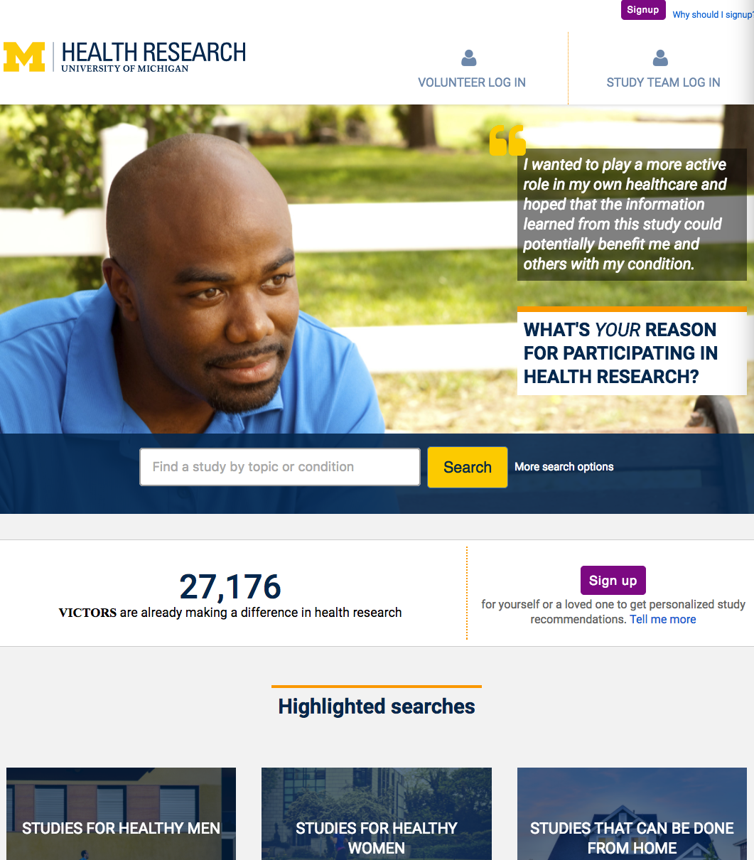
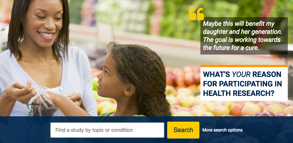
HERO images are used as a backdrop for marketing messages on the home page. These images set the tone for the experience potential volunteers will have with your recruitment efforts.
Examples

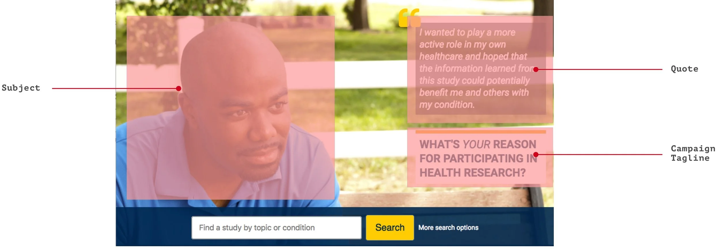
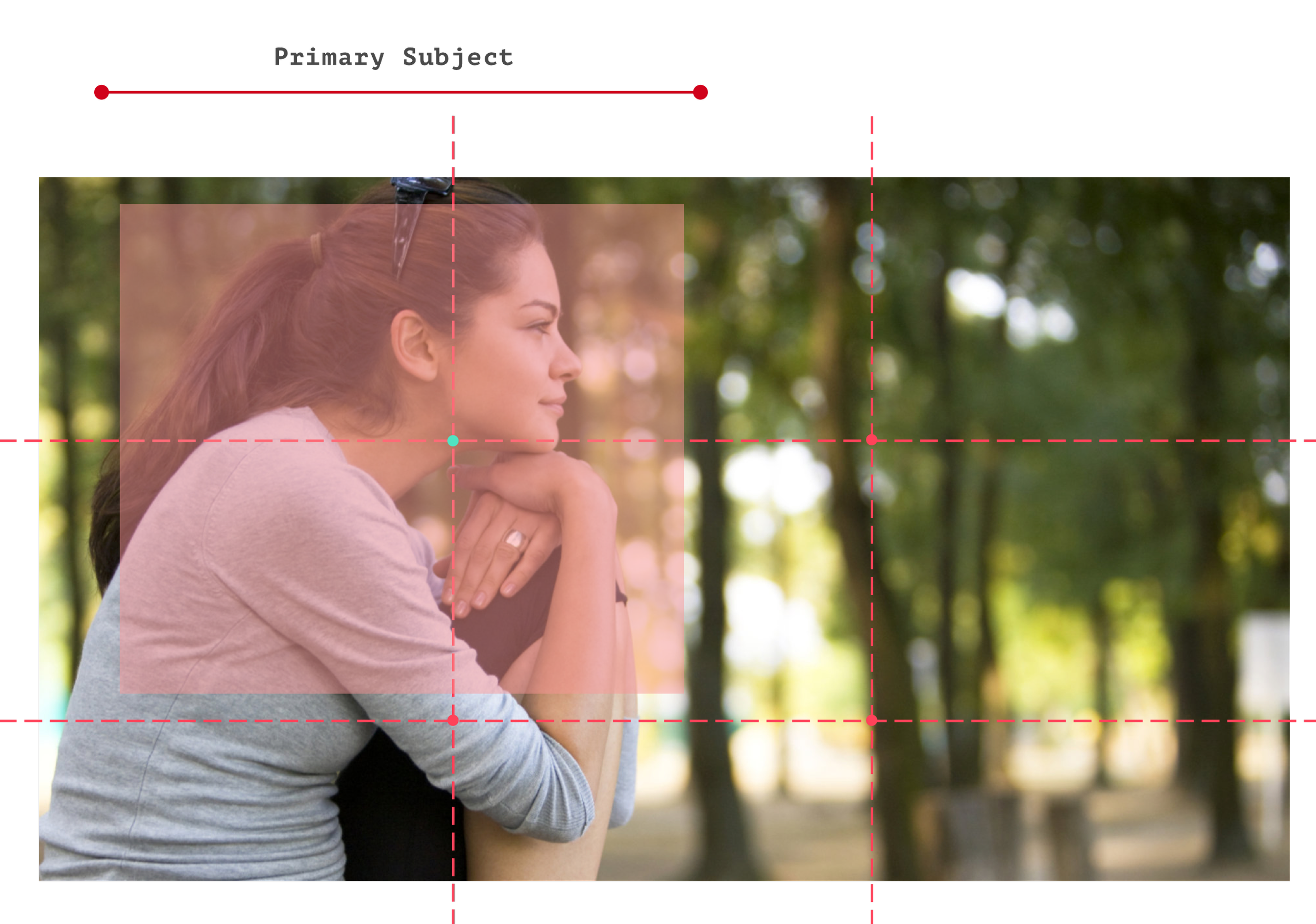
Anatomy of a HERO banner on the homepage
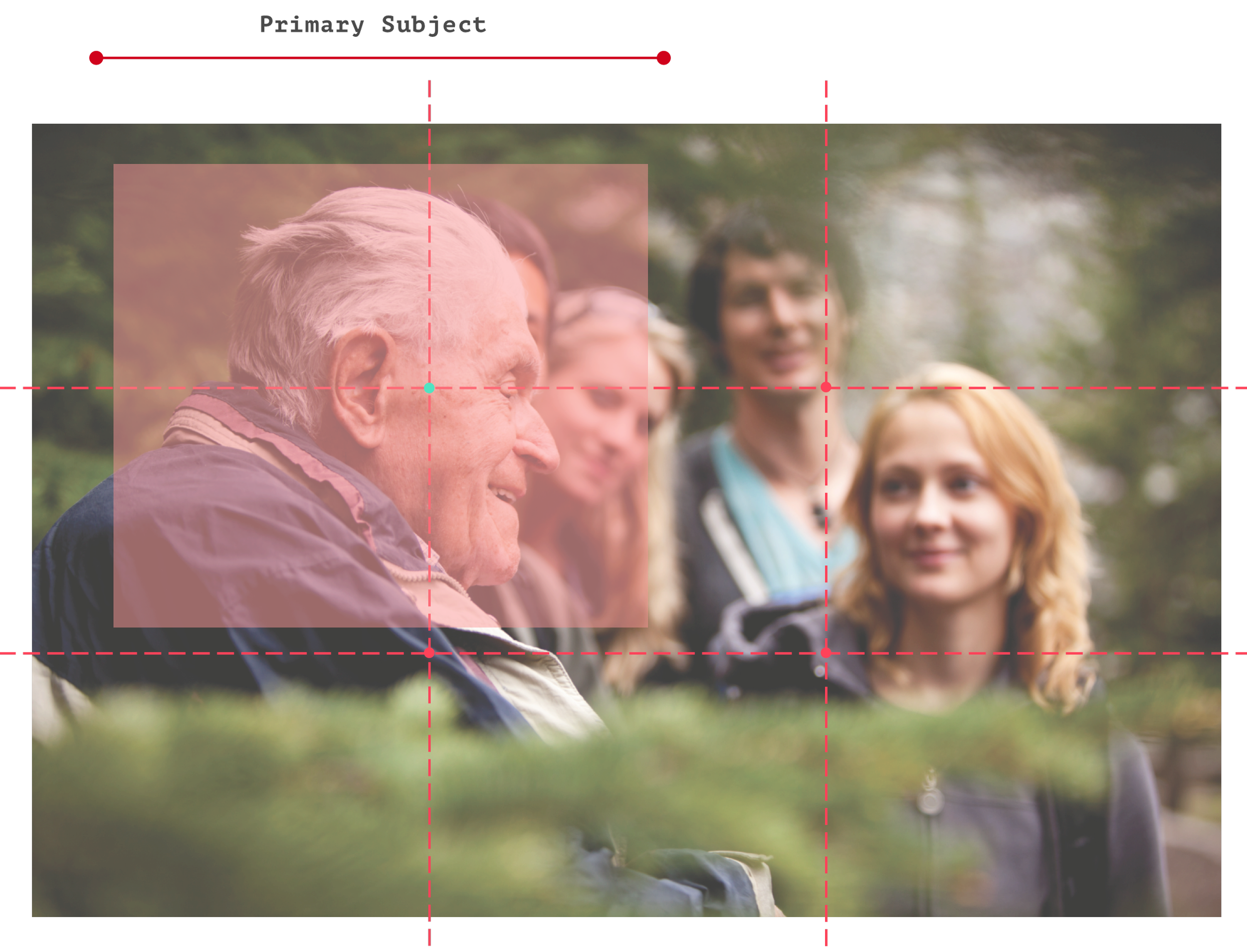
Choosing/creating HERO images
Do
Minimum Image Size: 1920px X 1080px
Compose/choose your image focusing on a primary subject
Center your primary subject's face in the top-left third portion of the image depicted by the red region and the green dot.
Don’t
Have an image smaller than this size
Have more than one area of focus
Have the subject on the right side of the image. This side will have the Quote and the Marketing Section superimposed on it.
Resources
Use this Composition Canvas to test out your photo's composition and it's suitability for being a HERO Image
Composition-Canvas.sketchHighlighted Searches
Introduction
Popular searches are used to provide volunteers quick browsing access through the homepage to study categories that are in high demand. Each category has a title and an accompanying background image.
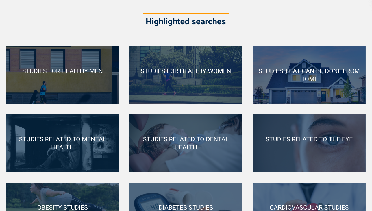
Anatomy of a Highlighted Search bucket

Choosing/Creating a Highlighted Search background image
Do
Ideal Image Size: 800 x 530px
Make sure image composition is simple yet meaningful
Avoid bold color compositions as it may make text hard to comprehend
Illustrations in emails
Some of our emails have illustrations used in them.
Examples
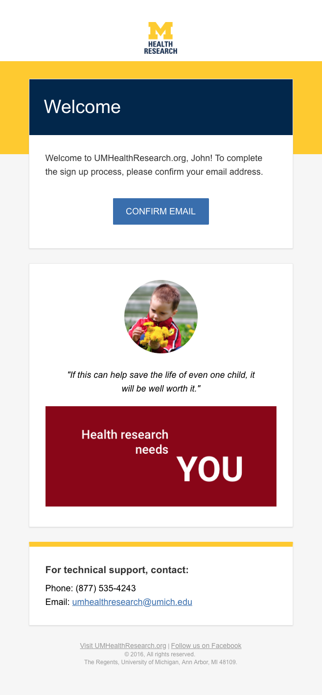
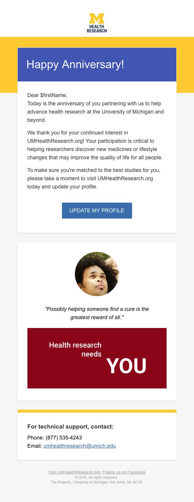
Illustration Images

Quote Sources


Font Specifications
Primary Font Family
The application is carefully typeset using the Roboto font family. These fonts are served by Google Fonts.
abcdefghijklmnopqrstuvwxyz
1234567890(.,;?!$&*)
abcdefghijklmnopqrstuvwxyz
1234567890(.,;?!$&*)
abcdefghijklmnopqrstuvwxyz
1234567890(.,;?!$&*)
abcdefghijklmnopqrstuvwxyz
1234567890(.,;?!$&*)
abcdefghijklmnopqrstuvwxyz
1234567890(.,;?!$&*)
Usage
Backup Font Family
As a backup to a web font, we use Arial. This font is only served when the Primary Font Family fails to be served over the internet. Arial is a system font.
abcdefghijklmnopqrstuvwxyz
1234567890(.,;?!$&*)
abcdefghijklmnopqrstuvwxyz
1234567890(.,;?!$&*)
abcdefghijklmnopqrstuvwxyz
1234567890(.,;?!$&*)